Proving Drawer
My roles:
Timeline:
Tools:
October 2022 - January 2023
Competitive Analysis
User Interviews
User Flows
The Problem
UI Design
Trying to find bread recipes means sifting through numerous baking websites that seem to be more focused on telling you a story rather than on the recipe itself. The ability for a baker to filter by bread type, ingredients, or methods once they have picked the bread recipes out from other bakes is rare.
Baking sites are about baking, not bread.
The Solution
Approaching with a bread baker’s perspective required a clean and precise design while keeping the needs of the home baker up to the pro in mind. Keeping the focus on the recipe itself, while also giving the ability to filter different variables was important.
User Interviews
Nobody enjoys how far down the page the recipe is found.
The one constant was that even with a jump to recipe button, nobody enjoys how far down the page the recipe is found.
None of the interviewees were happy with how they saved recipes. One used Pinterest more than anything else but wasn’t happy with how they were organized and that they weren’t searchable.
3 of the 4 make the amount called for in the recipe out of convenience. The most experienced baker was the only person to adjust serving sizes, but two others expressed interest in scaling recipes.
User Personas
Wireframing
“Just give me the damn recipe.”
Every frustration that was mentioned in the user interviews came down to distractions or inefficiencies in the recipe search process, so I wanted to build my personas around people with active lives that can’t stop everything for a loaf of bread.
User Flows
The theme of this project was clean and to-the-point, and the user flow needed to match, keeping as few clicks as possible between the user and their destination.
Low and Mid Fidelity Wireframes
Most of the low fidelity wireframes made the transition to digital without too many changes but the recipe page in particular was unworkable as it was sketched out. I had hoped to show the recipe ingredients even while scrolling through the directions, but there just wasn’t enough real estate. This page would continue to be the problem child.
Peer Critiques
“cluttered” “confusing”
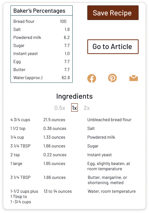
This section of the recipe screen had been the among the most frustrating to conceive. I couldn’t find a way to fit all of the information in an easily scannable fashion. Not surprisingly, it received the most comments from the peer critique session. The Ingredients section was hard to read, the scalar function under Ingredients wasn’t clear, and it was generally overcrowded, so I needed to reimagine the entire section.
Some rounds of iteration later I landed upon this solution, which gives everything more room to breathe and makes each function clearer. It ended up being one of the more satisfying elements of the project because of how far it came from the original idea.
Responsive Designs and Mockups
Style Guide
Typography
Icons and UI Elements
Buttons
Primary
Secondary
Primary Accent
Secondary Accent
Tertiary Accent
Next steps
The saved recipes area needs to be expanded and customizable to give people a sense of ownership of their profile and recipes.
I want to build out a way for people to publish their own recipes with a public and private page so they can make this app into their online recipe resource and not just a collection of bookmarks.
Comments are needed for specific issues or concerns as well as making for a more welcoming and inclusive environment.
Thank you for reading!
Home Home menu Category Search results Search filters Recipe Recipe article Profile


